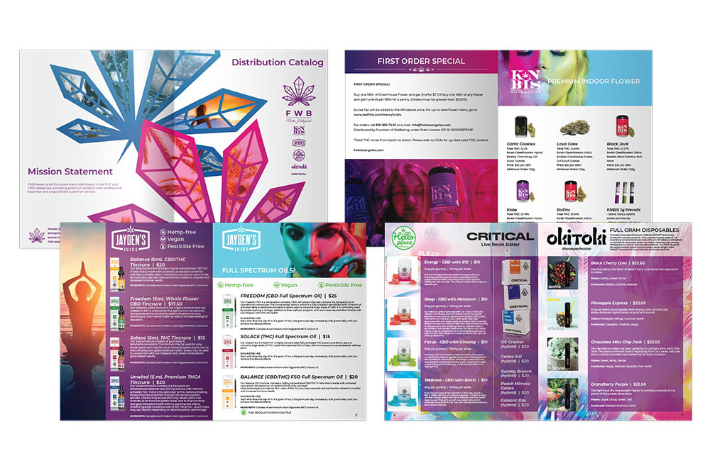
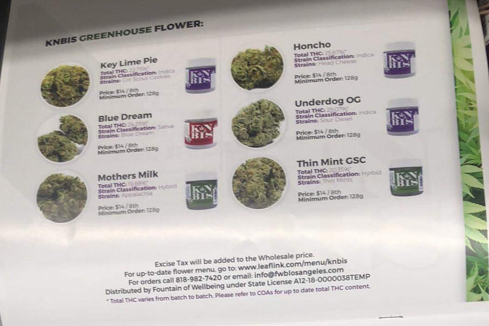
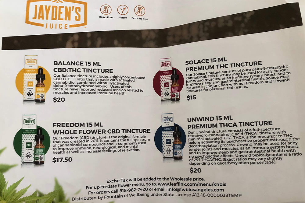
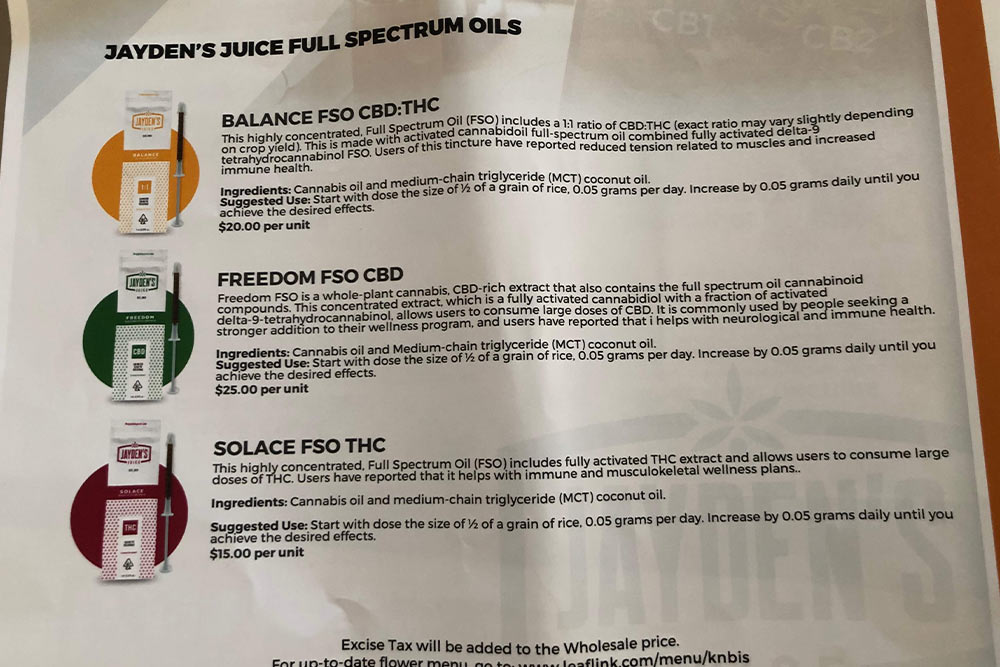
Fountain of Wellbeing is a licensed cannabis distribution and retail company based in North Hollywood. They carry a variety of premium indoor grown flower, concentrate, vapes, vitamin gummies, and wax. Their business mission is to produce quality, premium products and bring more awareness to the benefits of cannabis consumption.
Their Business Needs and Branding Goals:
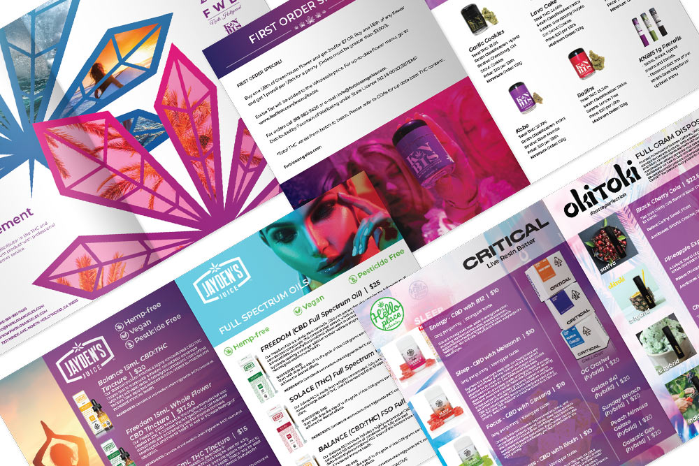
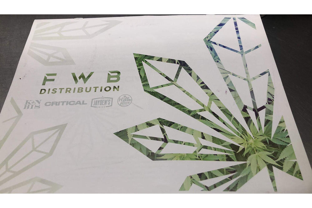
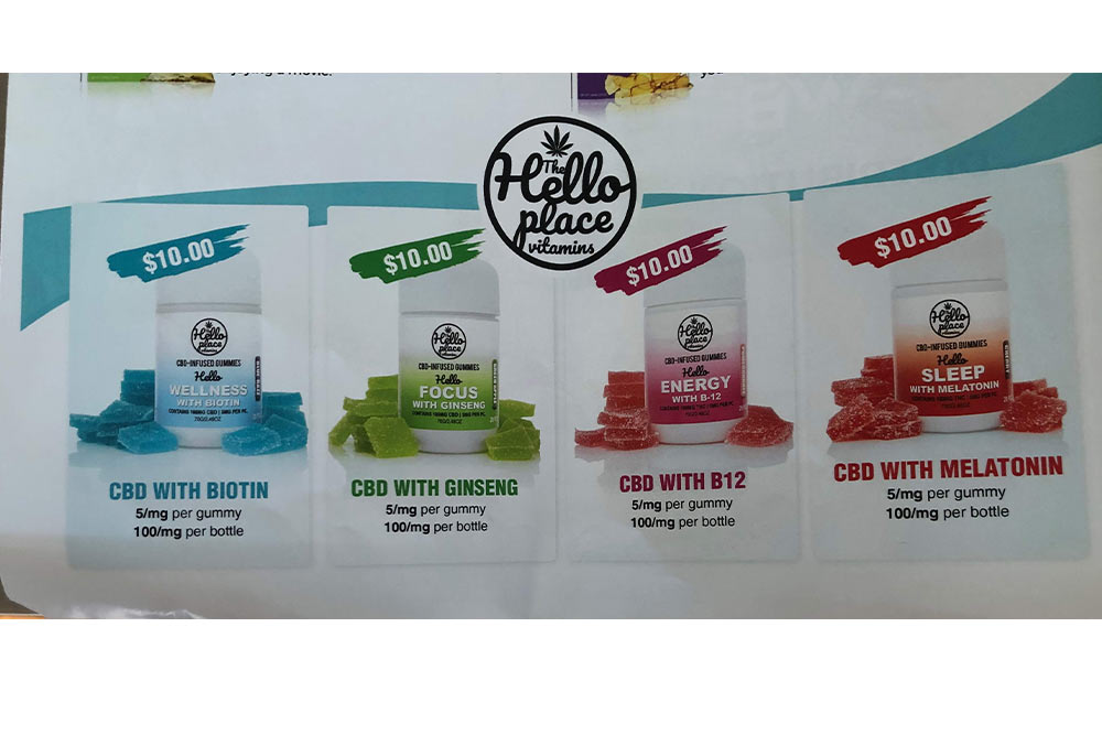
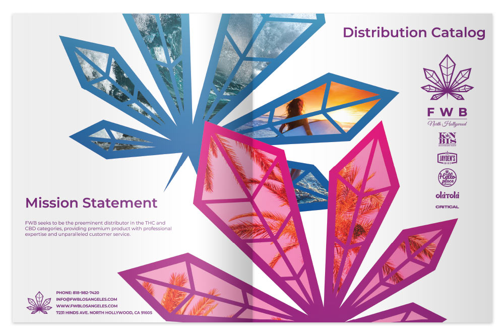
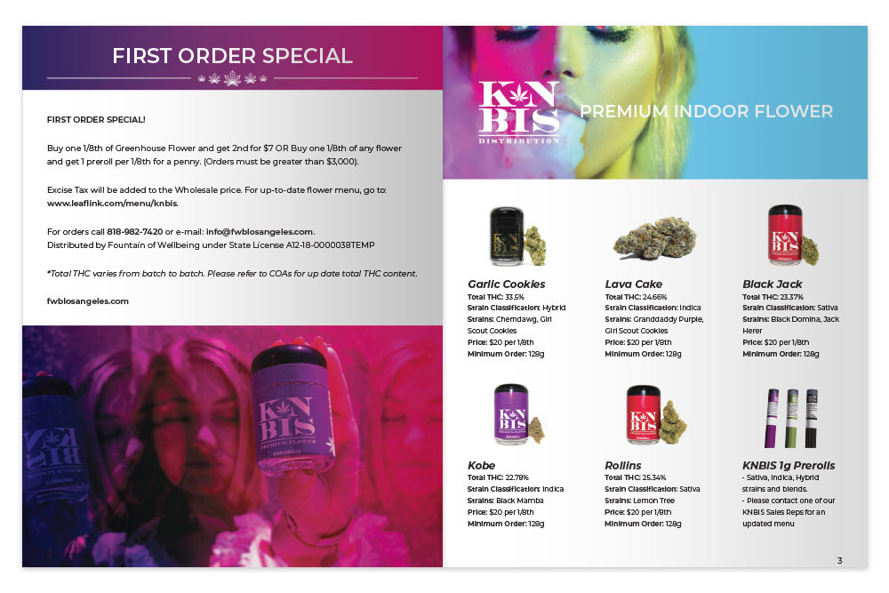
Fountain of Wellbeing needed a professionally designed sleek and clean-cut editorial style catalog that includes some of the strains while giving the brand a cleaner, more polished look and over all feel. Their KNBIS brand indoor-grown premium flower caters to a coastal, but active lifestyle.
They were in search of vibrant colors, san serif fonts, and in love with dark, hombre purple. Fountain of Wellbeing had a deep desire to incorporate a high-end, California vibes, and psychedelic feel. They wanted to use vibrant neon colors to break free of the generic corporate atmosphere to move outside of the box of a manicured and plain business style.
The Solution to Their Needs:
Focusing on their need for a redesigned catalog in a classy, sleek style while still appealing to their active lifestyle brand goals. The catalog’s purpose would be to be more in line with their brand direction, generate more interest in their products, and increase conversion rates of their customers.
Final Deliverables:
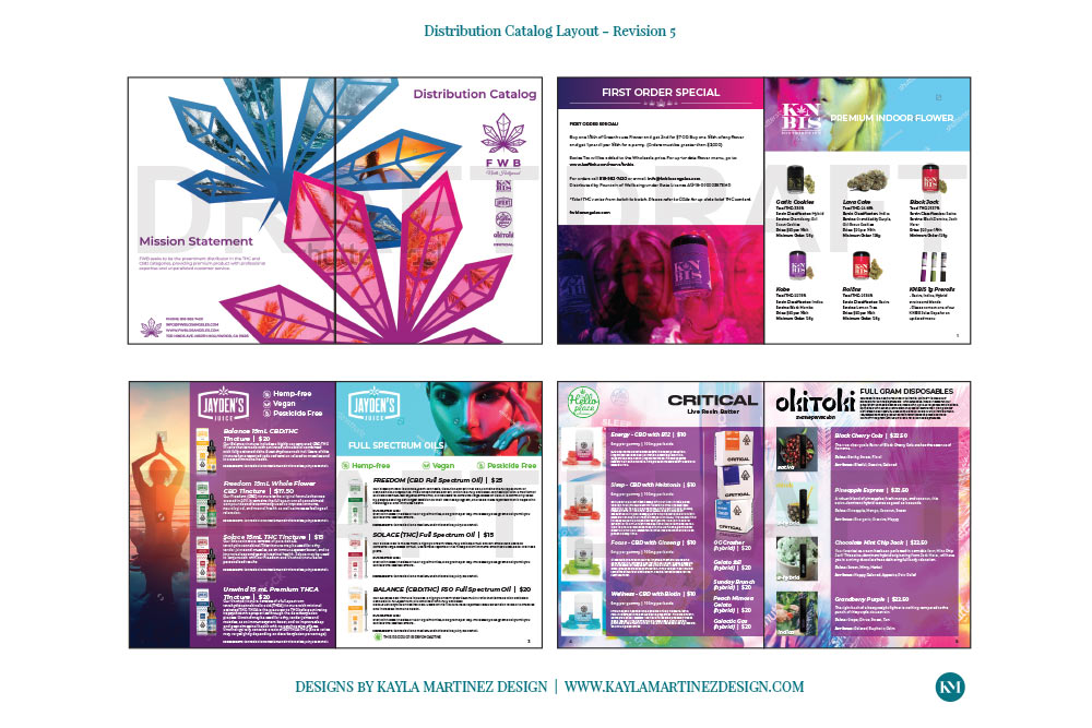
The project consisted of 3 variations for the initial round and then revisions to get to the final catalog design. The catalog was 8 pages and a print ready file was provided to Fountain of Wellbeing.
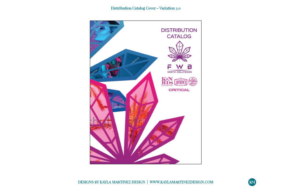
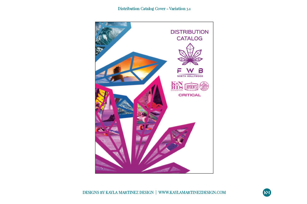
First Design Round – Catalog Variations
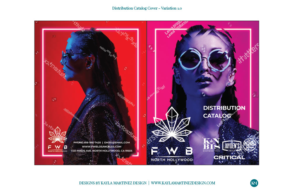
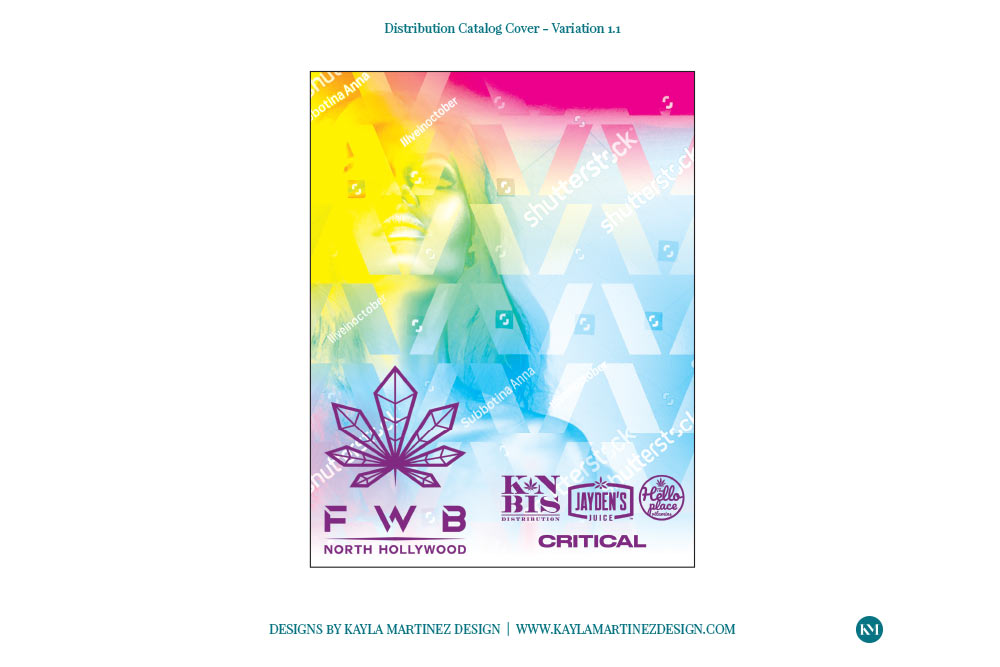
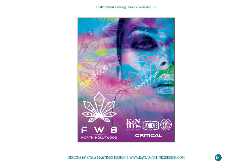
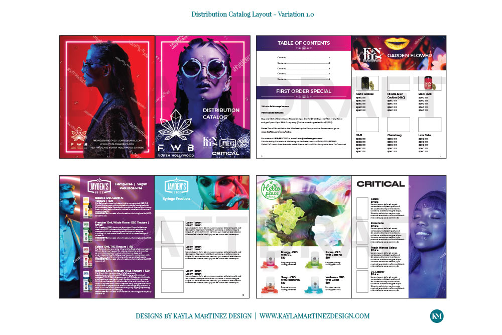
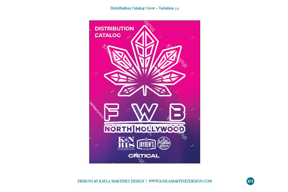
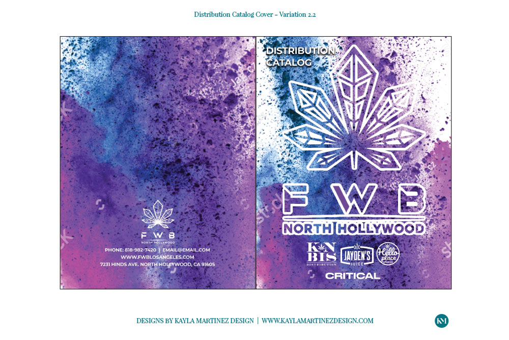
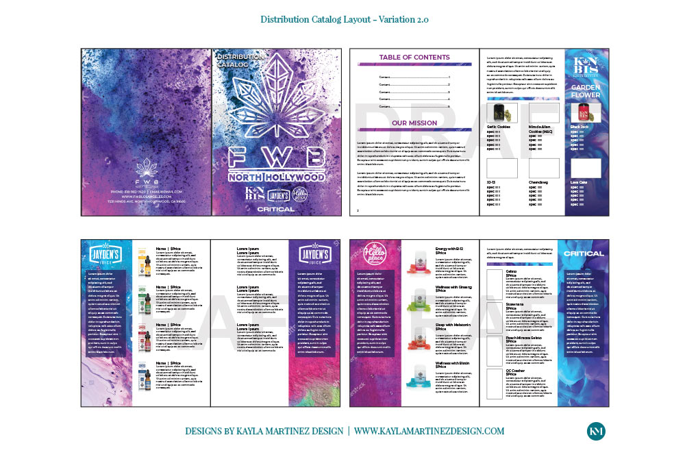
After the Creative Brief was completed I took off, with so many ideas in my head. When I work I show 3 variations for the client to pick one and then we can move onto the next stage of fine tuning the selected design from this round.
I had so many ideas that I decided to treat the client to 3 inside layouts and 6 catalog covers. That’ll happen from time to time if I can’t contain all of my ideas.
In round 1 of the design process for the catalog the client loved all of the variations and had a tough time deciding. I am flexible with my design work and I let them know that they could mix and match the variations to get their perfect catalog layout and design elements. I want to make it easy for clients and they were happy to know that they weren’t locked to using ALL of variation 1 or ALL of variation 2, etc.
Their ultimate decision was to combine the covers from variation 3 and the inside layout from variation 1.
*Click on thumbnails to enlarge images and activate the gallery view.
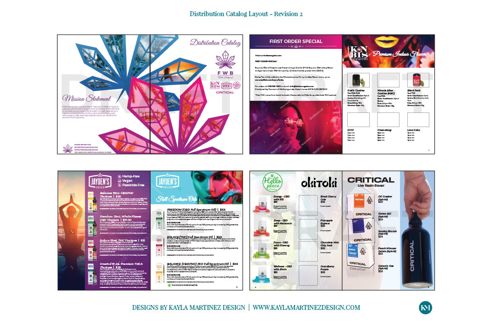
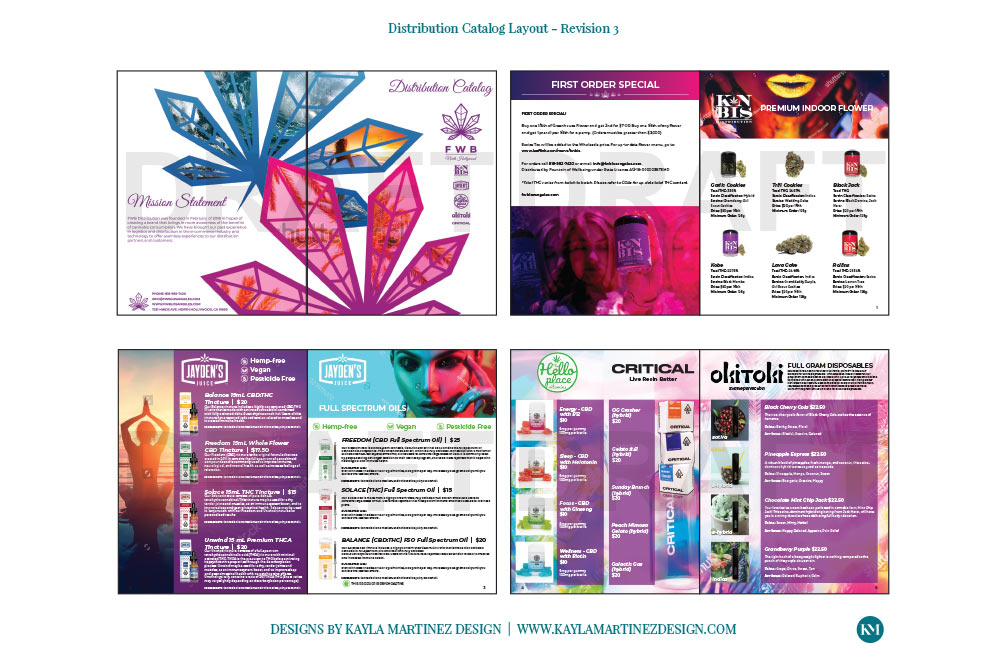
Design Rounds – Catalog Revisions
After deciding on the layout and covers from the variations it was time to fine tune the selected graphics. The revision rounds can be seen below.
Final Files – Catalog Approved Design
Once the final design revision was complete I created the final high resolution, print ready file. The client was absolutely in love with the final result! This was an amazing project to work on. It was so much fun and the final piece came out beautifully. I am very proud of this one.
Happy Client Testimonial
Check out this testimonial! Like I said, Fountain of Wellbeing absolutely LOVED the catalog. The whole process was smooth and the final piece is beautiful and is on point with their brand goals stated at the start of the project.
“Kayla was absolutely wonderful to work with. She was not only on top of all of the deadlines, but has an incredibly creative eye for design in general. I simply gave her inspo images and she put together the most beautiful product catalog for our company. I will definitely be working with her in the future and would happily recommend her to anyone.”
– Nina Dias, Director of Marketing
Results
This catalog became their most utilized sales tool. Not only was it on regular re-order for stocking in their stores, it also increased their partnerships since it created massive attention with their target audience and other brands wanted to be included in the catalog. This resulted in a significant increase in customers and in turn sales that they, and all partners, benefitted from.
This website uses cookies to improve your experience. If you continue on this site without changing your cookies settings, we'll assume you're ok with the cookies on the Kayla Martinez Design website. If not, you can change your cookie settings at anytime if you wish. See how to change your cookie settings or to learn more about our Privacy Policy and Terms and Conditions by clicking the 'Read More' link. Read MoreACCEPT
Privacy & Cookies Policy
Privacy Overview
This website uses cookies to improve your experience while you navigate through the website. Out of these cookies, the cookies that are categorized as necessary are stored on your browser as they are as essential for the working of basic functionalities of the website. We also use third-party cookies that help us analyze and understand how you use this website. These cookies will be stored in your browser only with your consent. You also have the option to opt-out of these cookies. But opting out of some of these cookies may have an effect on your browsing experience.
Necessary cookies are absolutely essential for the website to function properly. This category only includes cookies that ensures basic functionalities and security features of the website. These cookies do not store any personal information.